
Faith of the Nations
Redesigning a Nonprofit Experience to Build Trust and Inspire Action
I independently led the UX/UI and visual identity redesign of Faith of the Nations, transforming an outdated, fragmented website into a clearer digital experience that connects the organization's mission with meaningful opportunities to give.
ROLE
UX/UI Designer · Sole Designer
STATUS
Launched · Live Website
TIMELINE
April – May 2026
SCOPE
Brand Identity, UX Strategy & Website Design
TOOL
Figma
PLATFORM
Responsive Web
CLIENT
Faith of the Nations
COLLABORATION
Client, CEO, Marketing & Developers
0 2 · T H E C H A L L E N G E
A Strong Mission Hidden Behind a Weak Digital Experience
Faith of the Nations had an important mission, but its existing website made that mission harder to understand and support.
An outdated visual identity, cluttered content, and a blog-heavy structure made the experience difficult to navigate. Important initiatives lacked visibility, while the general donation journey offered limited information about the specific causes visitors could support.
The challenge extended beyond visual modernization. The website needed a clearer structure, stronger trust signals, and more purposeful ways for visitors to engage with the organization.
01
H O W M I G H T W E
How might we transform a fragmented nonprofit website into a clear, trustworthy experience that helps visitors connect with the mission and take meaningful action?
Outdated Identity
The previous website and cluttered logo lacked the clarity and consistency needed to communicate the organization's mission effectively.
02
Confusing Information Structure
Scattered content and blog-oriented navigation made essential pages and initiatives difficult to discover.
03
Low Engagement
Limited website traffic, short visits, and weak donation activity highlighted the need for a more engaging experience.
04
Unclear Donation Opportunities
A general giving journey provided limited context about the people and projects visitors could support.
0 3 · M Y R O L E R E S P O N S I B I L I T I E S
Leading the Design Independently, From Discovery to Delivery
As the sole UX/UI Designer assigned to Faith of the Nations, I took ownership of the website redesign from the earliest client discussions through development-ready designs.
I worked directly with the nonprofit through one-on-one conversations to understand its needs, clarify priorities, and translate feedback into design decisions. In parallel, I collaborated with the CEO, marketing team, and developers to align the experience with the organization's goals and technical requirements.
My role went beyond interface design. I restructured the website, proposed more transparent donation journeys, redesigned the logo, established the visual identity, and prepared a cohesive set of designs for implementation.
03
Brand Identity & End-to-End Design
Redesigned the organization's logo, defined its visual identity, and created wireframes, reusable components, and high-fidelity website designs.
04
Cross-Functional Collaboration & Handoff
Partnered with the CEO, marketing team, and developers to align design decisions, clarify implementation requirements, and support the launch of the redesigned website.
01
Client Discovery & Communication
Led one-on-one client conversations, gathered requirements, presented design directions, and incorporated stakeholder feedback throughout the project.
02
UX Strategy & Information Architecture
Restructured the website's information architecture, simplified navigation, and defined clearer user journeys to help visitors discover key initiatives and donation opportunities.
0 4 · D I S C O V E R Y & R E S E A R C H
Finding the Real Opportunities Behind the Redesign
My process began with understanding the nonprofit's priorities and identifying where the existing website created friction.
Through direct client conversations and a review of the original website, I identified opportunities to simplify navigation, strengthen the visual identity, and give important initiatives - particularly Mas Casa - greater visibility.
I also conducted exploratory AI-assisted secondary research into donor motivations and donation transparency. This informed a key design hypothesis: supporters may feel more confident giving when they understand exactly what their contributions are intended to support.
P R O J E C T A S S U M P T I O N S
01
02
03
04
Understand the Client
Gathered requirements through direct conversations, clarified priorities, and aligned the project with the organization's vision.
Audit the Experience
Reviewed the existing content, navigation, branding, and donation pathways to identify opportunities for improvement.
Explore Donor Motivations
Used exploratory secondary research to investigate how transparency and clearly defined causes may influence donation decisions.
Define Strategic Priorities
Focused the redesign on clearer navigation, stronger mission visibility, more purposeful donation journeys, and a cohesive visual identity.
Modernize the visual identity
Prioritize Mas Casa
Build trust through design
Create clearer giving pathways
Simplify site navigation
Make the mission clearer
Highlight key initiatives
Establish a blue & gold identity
R E S E A R C H I N F O R M E D I N S I G H T
People may be more willing to contribute when they can connect a donation to a specific person, project, or purpose.
0 5 · I N F O R M A T I O N A R C H I T E C T U R E
Simplifying the Structure, Elevating the Mission
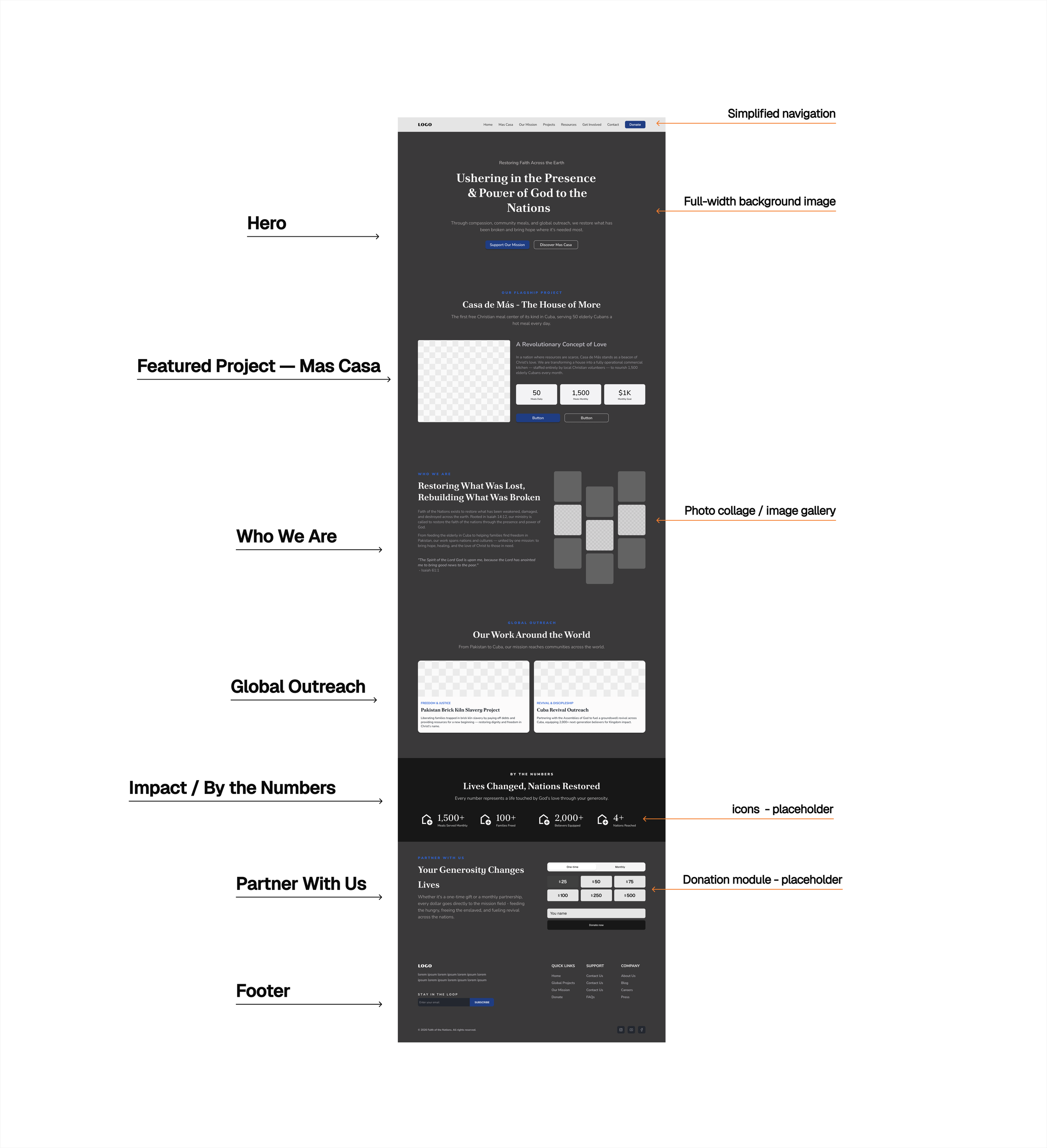
Low-Fidelity Homepage — Early Design Direction
With the core challenges identified, I focused on turning a fragmented website into a clearer, more purposeful experience.
I restructured the information architecture around how visitors could understand the mission, explore key initiatives, and take action. This meant simplifying navigation, reducing emphasis on outdated blog content, and creating more direct pathways to relevant projects and donation opportunities.
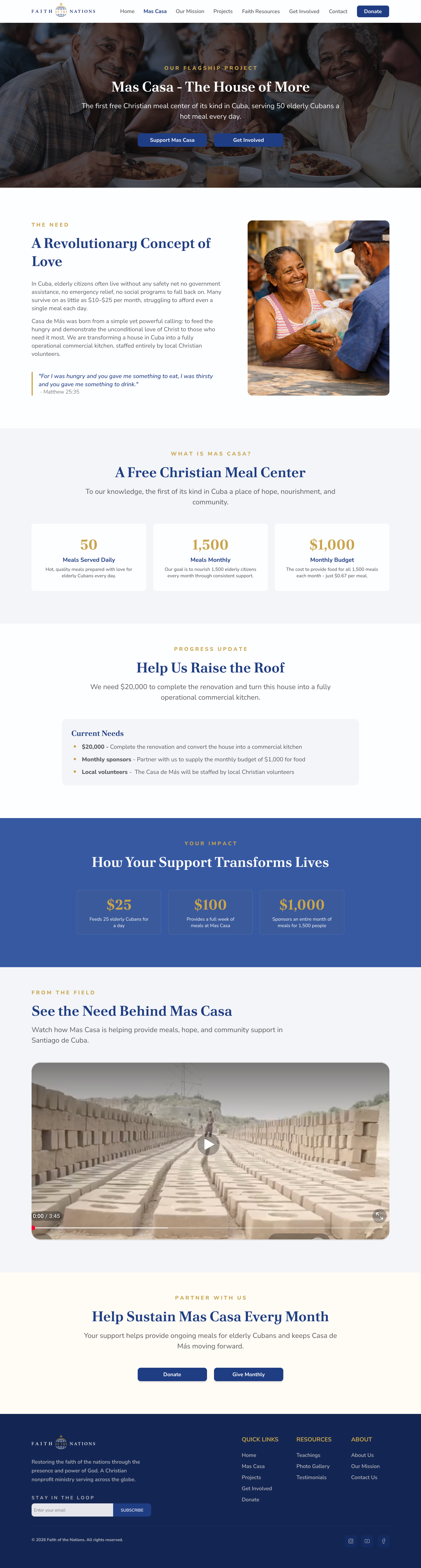
Mas Casa, the nonprofit's flagship initiative, became a central part of the experience — prominently featured on the homepage and supported by a dedicated project page.
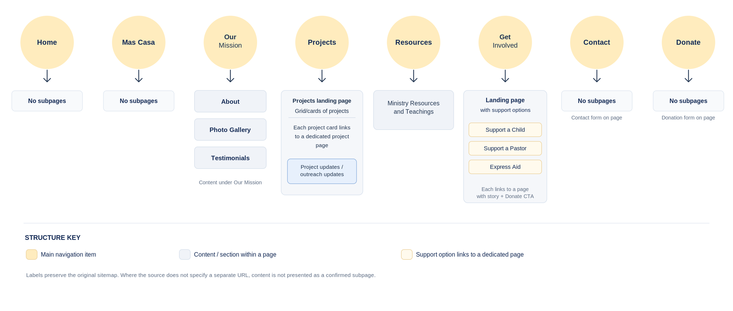
Before moving into visual design, I developed a sitemap and low-fidelity homepage wireframes to define page relationships, content hierarchy, and the placement of key calls to action.

Simplified Navigation
Reorganized content into clear categories, helping visitors find essential information and opportunities to get involved.
Prioritized Mission Content
Elevated Mas Casa and other key initiatives, connecting the organization's mission to specific projects visitors could explore and support.
Early structural decisions focused on helping visitors move from understanding the mission to supporting it.
Clear Calls to Action
Introduced prominent pathways to learn more, discover projects, and support the causes that matter to visitors.
0 6 · K E Y U X D E C I S I O N / D O N A T I O N S T R A T E G Y
Making Every Contribution Feel More Purposeful
Making Every Contribution Feel More Purposeful
One of the most important decisions I made was proposing a shift away from a single, general donation appeal. The existing approach offered limited clarity about the specific people and projects supporters could help.
My exploratory, AI-assisted secondary research suggested that donors may feel more confident contributing when they understand exactly where their support is intended to go.
B E F O R E
One General Donation Journey
A broad donation appeal offered limited visibility into the specific people, programs, and initiatives each contribution could support.
General Donation

Unclear Allocation
F E A T U R E D C A M P A I G N S
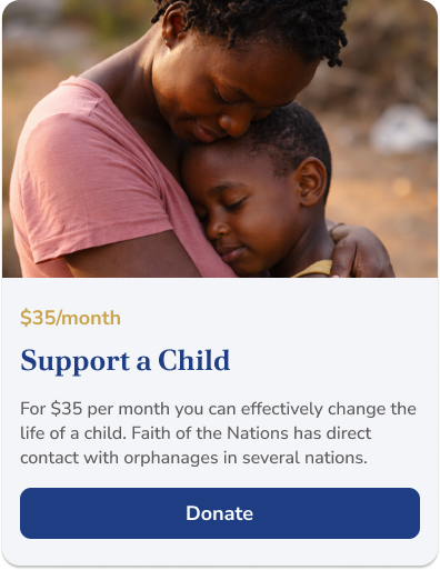
Support a Child
A focused donation journey that connects a $35 monthly contribution to a specific cause, helping supporters understand who they are helping and make a more informed giving decision.
A F T E R
Dedicated Fundraising Campaigns
Cause-specific journeys help supporters choose what matters to them, understand the intended impact, and contribute with greater clarity.
Choose a Cause

Understand the Purpose
Make a Donation
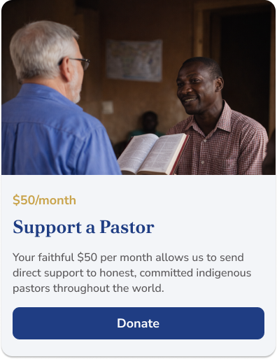
Support a Pastor
A dedicated donation journey that connects a $50 monthly contribution to supporting pastors and their ministry work, making the purpose of each gift clear and tangible.
01
SPECIFICITY
The design shift: From asking visitors to donate generally to helping them choose exactly what they want to support.
TRANSPARENCY
03
CLARITY
I proposed dedicated fundraising journeys for specific causes, replacing a broad appeal with clearer choices, transparent information, and a more direct connection between each donation and its purpose.
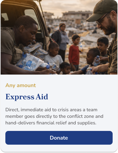
Express Aid
A flexible donation journey that allows supporters to contribute any amount toward emergency relief, clearly connecting their gift to urgent needs and immediate assistance.
Designing the Donation Experience
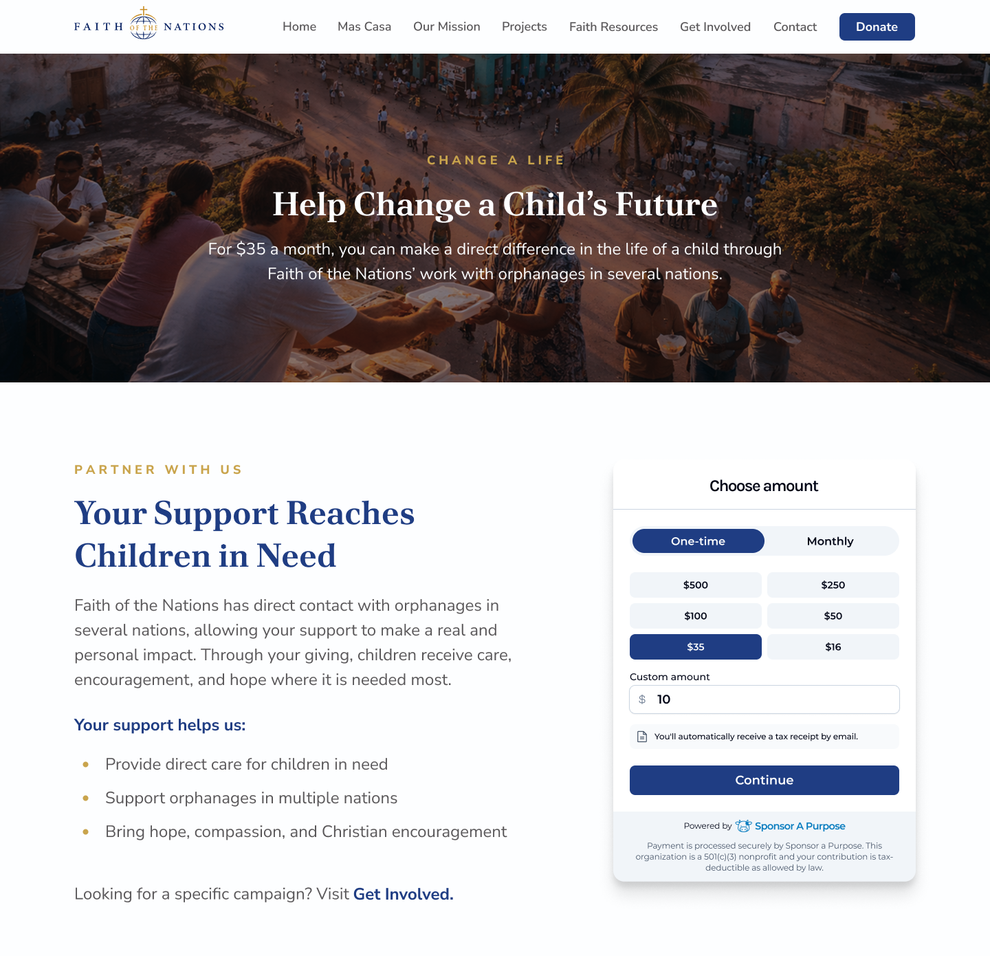
I designed the campaign pages to connect each cause with a clear explanation of its purpose and an accessible donation form. Supporters can understand what their contribution supports, select an amount and giving frequency, and proceed toward completing their donation.
Make donation amounts, giving frequency, and next steps easy to understand and navigate.
F O U R D E S I G N P R I N C I P L E S
02
04
CONFIDENCE
Connect each contribution to a clearly defined cause, helping supporters choose who or what they want to help.
Clearly communicate the purpose of each campaign and what the contribution is intended to support.
Reduce uncertainty with relevant information, straightforward choices, and prominent calls to action.
0 7 · B R A N D I D E N T I T Y & V I S U A L S Y S T E M
Building a Visual Identity from the Ground Up
02 L O G O R E D E S I G N
The redesign went beyond improving the website’s structure. The nonprofit also needed a clearer, more cohesive visual identity that reflected its mission and helped build trust.
The existing logo was difficult to read, with crowded lettering and competing visual elements. The client wanted a new direction that felt more professional and aligned with the redesigned website.
Working from a broad preference for blue and gold, I independently redesigned the logo, defined the color palette, and established a consistent visual language.
I then translated this identity into typography, navigation, buttons, donation forms, project cards, and reusable UI components.
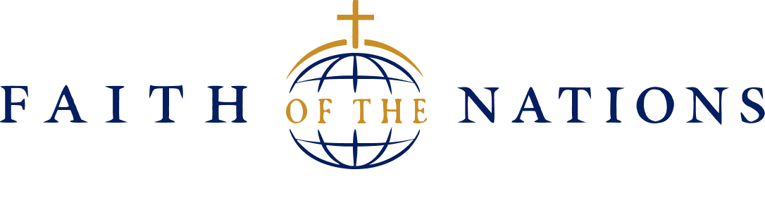
AFTER - REDESIGNED LOGO
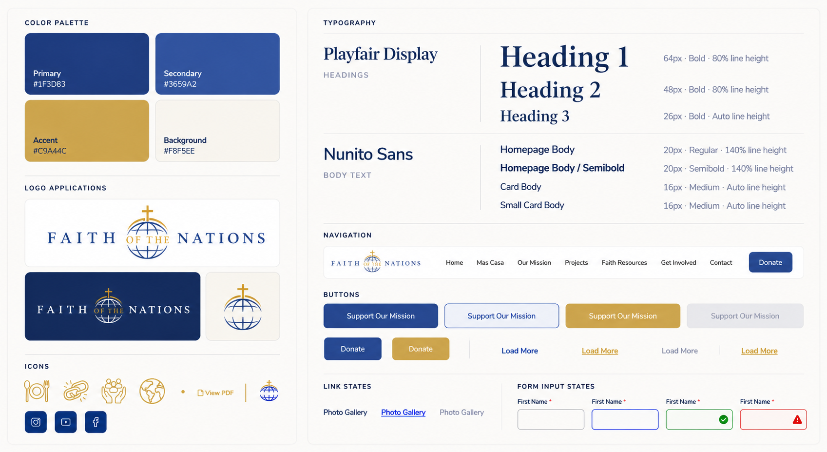
04 U I C O M P O N EN T S & D E S I G N S Y S T E M
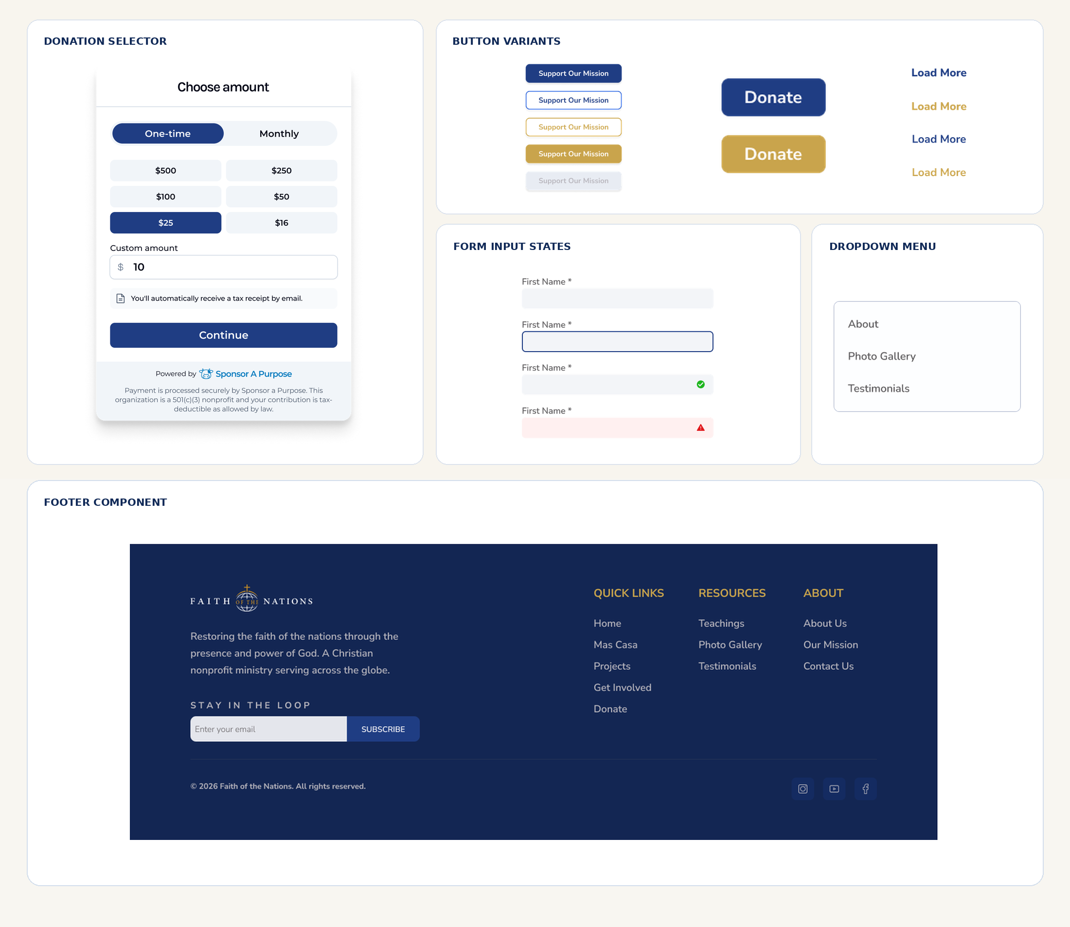

BEFORE - ORIGINAL LOGO
I redesigned the original, visually complex logo into a cleaner and more versatile identity, improving legibility and creating a stronger visual connection to the website's new design system.
03 C O L O R & T Y P O G R A P H Y
Clarity
Simplified visual hierarchy and consistent typography made the organization's mission, content, and calls to action easier to understand.
Credibility
A refined logo, cohesive color palette, and consistent interface established a more professional and trustworthy visual identity.
Scalability
Reusable components and shared design patterns created a consistent foundation for future pages, projects, and fundraising campaigns.
0 8 · F I N A L W E B S I T E D E S I G N & I M P L E M E N T A T I O N
From Design System to a Complete Website
From Design System to a Complete Website
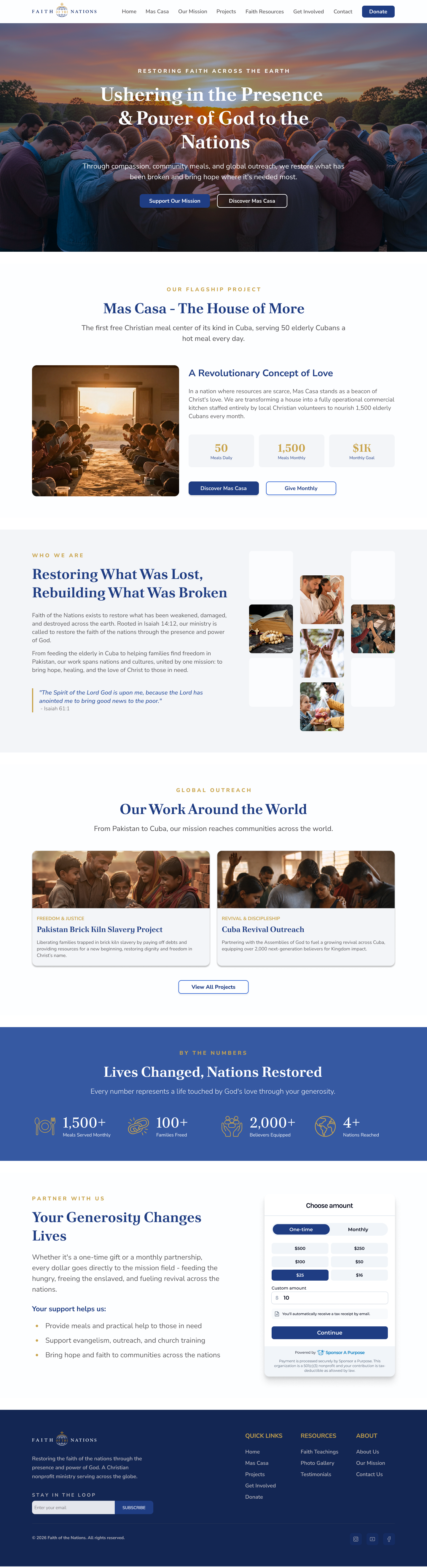
DESIGN 01 · PROJECT DISCOVERY

I translated the UX strategy, information architecture, and visual identity into detailed high-fidelity designs across the nonprofit’s website.
Beyond the homepage and donation journeys, I designed different types of experiences, from project discovery to a structured resource catalog, while maintaining consistent navigation, typography, and reusable UI patterns.
As the sole designer, I prepared development-ready layouts and worked closely with developers and the wider team to clarify implementation details and support design consistency through launch.
The website was successfully launched, bringing the redesigned experience to life.
DESIGN 02 · RESOURCE DISCOVERY
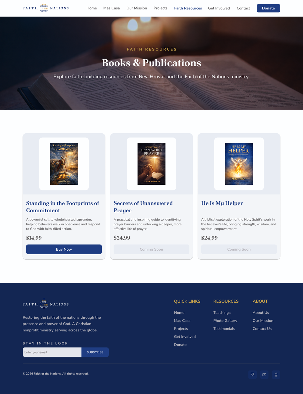
Faith Resources
I designed a consistent resource catalog with clear publication details, pricing, and distinct action states. Reusable card patterns make the content easy to browse while maintaining consistency with the wider website experience.
Projects & Missions
I designed a structured project discovery experience that brings global initiatives into one clear, scannable view. Project cards, ministry updates, and contextual calls to action help visitors move from exploring the organization's work to understanding how they can support it.
From Figma to Launch
I prepared detailed layouts and reusable UI components for development, collaborating with engineers to clarify implementation details and support visual consistency throughout the build.
The redesigned website was successfully launched, bringing the new information architecture, visual identity, and user journeys into a working digital experience.
EXPLORE THE COMPLETE DESIGN
22 High-Fidelity Screens. One Cohesive Experience.
Explore the full set of final website designs, including page variations, supporting journeys, and reusable design patterns.
0 9 · O U T C O M E S & R E F L E C T I O N
From Better Clarity to Measurable Progress
The redesign went beyond visual improvements. It introduced a clearer information architecture, a cohesive visual identity, and dedicated donation journeys that connected supporters with specific causes.
Approximately two to three months after launch, the Sponsor A Purpose team reported improvements in website traffic, completed donations, and visitor engagement.
Faith of the Nations also had access to Sponsor A Purpose's nonprofit CRM and reporting platform to support fundraising management and performance tracking.
+30%
Completed Donations
Reported increase in the number of completed donations after launch.
Post-launch results reported by the Sponsor A Purpose team approximately 2–3 months after release. These figures reflect overall website performance and do not isolate the impact of individual design decisions.
WHAT THIS PROJECT TAUGHT ME
01
Taking Ownership Beyond the Brief
The client initially needed a more modern website, but the deeper opportunity was to clarify how visitors discovered the mission and chose to contribute. Working independently taught me to translate broad requests into focused design priorities and actionable recommendations.
02
Connecting User Needs to Organizational Goals
Rethinking the donation experience reinforced the importance of making the purpose of each contribution tangible. Dedicated giving journeys connected the organization's fundraising priorities with visitors' need for clarity and confidence.
What I Would Explore Next
With more time and access to users, I would validate the donation journeys through usability testing, identify potential drop-off points in the giving process, and compare completion rates across campaigns.
These insights would help test the assumptions behind the redesign and guide future improvements based on observed user behavior.
LONGER
Time on Site
Visitors reportedly spent more time exploring the redesigned website.
03
Designing for Delivery and Measurement
Collaborating directly with the client, leadership, marketing, and developers reinforced that good design must work beyond Figma. Clear specifications, reusable components, and post-launch performance feedback all contribute to meaningful outcomes.
GOOD DESIGN DOESN'T JUST COMMUNICATE A MISSION.
IT MAKES IT EASIER TO ACT.
Faith of the Nations reinforced my approach to design: take ownership of the problem, connect user needs with organizational goals, and build solutions that can be implemented, evaluated, and improved.
+20%
Website Traffic
Reported increase in website visits following the redesign.