
Perio.AI
Product Design Project
ROLE
DURATION
Solo UX/UI Designer
3 weeks
TOOLS
FIGMA
Year
10/06/2025
Product Design Project
PM Accelerator
Perio.AI is an AI-powered web app that helps patients better understand their gum health through clear visual summaries and educational support. This project was completed as part of my internship at the PM Accelerator, where I was tasked with designing an end-to-end experience. From onboarding and image upload to AI-powered diagnostics, education, and follow-up.
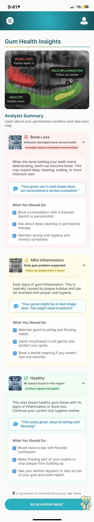
At the heart of the product is a color-coded X-ray overlay, offering a second opinion powered by AI. But this project was about more than features, it was about building trust in an experience that often feels rushed, technical, and emotionally overwhelming.
The Challenge
When I started working on Perio.AI, I assumed the biggest design hurdle would be making something “technically impressive.” But what surprised me was how emotionally loaded theproblem really was.
Many patients leave their dentist’s office with uncertainty. They’ve seen their X-ray, maybe heard something about “bone loss” or “gingival inflammation” - and that’s it. They’re left wondering:
“Is this serious?”
“Can I trust what I was told?”
“Am I being upsold treatment I don’t need?”
That gap between medical information and emotional understanding — is what I wanted to help close.
The Vision
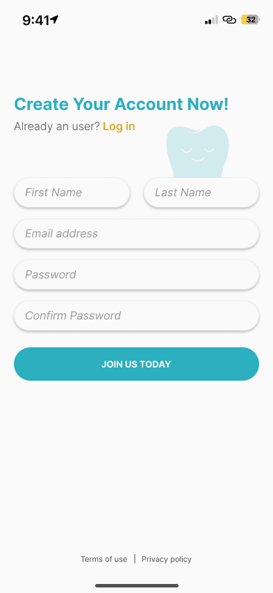
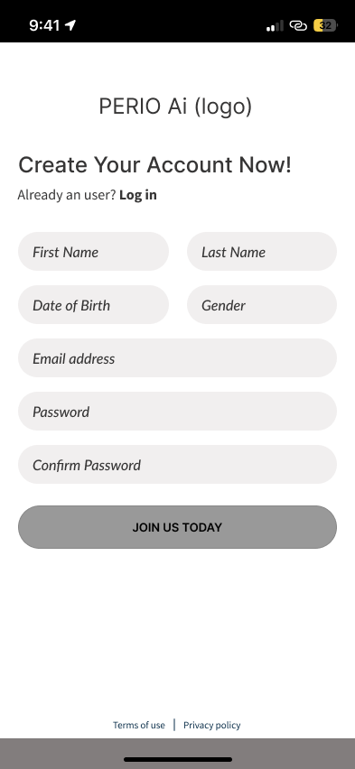
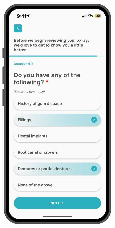
My task was to design an end-to-end patient journey, including:
● Onboarding and login
● Panoramic X-ray upload
● Visual gum health summary
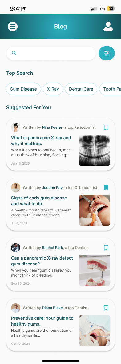
● Plain-language explanation and education
● AI-powered chat for follow-up questions
● Export/share functionality
“I just want to double check what my dentist said — without booking another appointment.”
“I need to see it clearly to really understand what’s happening.”
Research & Competitive Insights
Here’s what stood out:
● Mobile-first experiences for uploading images and messaging with providers
● Status indicators (e.g., “treatment progress” bars, appointment reminders)
● Data-heavy dashboards for practitioners
Competitive Comparison Table


From the beginning, I approached the work with empathy. Dental visits are often intimidating and fast-paced. I wanted this product to feel like the opposite: reassuring, clear, and empowering. This wasn’t just about UI, it was about designing trust into every step.
Real People, Real Needs - Target Users


Emily, a 44-year-old marketing exec, rushing between meetings, trying to remember what her dentist said. She wants something she can check quietly at home.
Key Needs
Quick, discreet access to information
Ability to revisit medical explanations at her own pace
Confidence that she understands her diagnosis correctly
Key Frustrations
Forgetting details shared during short appointments
Feeling unsure about the severity of her condition
Limited time to process complex information
John, a 67-year-old retiree who feels overwhelmed by medical language and relies on clear visuals to understand what’s going on.
Key Needs
Simple, visual explanations of medical conditions
Clear differentiation between normal findings and serious issues
Reassurance and trust in what he’s being told
Key Frustrations
Medical jargon that feels inaccessible
Anxiety caused by unclear or incomplete explanations
Difficulty remembering verbal instructions
Before jumping into userflows and wireframes, I used AI tools to conduct a quick competitive analysis of existing dental health and diagnostic platforms. My goal was to understand how other tools present oral health data to patients and where Perio.AI could stand out. I looked into platforms like DentalMonitoring, MouthWatch, and Zenyum, using product descriptions, feature walkthroughs, and user reviews to map key patterns. While these platforms offered useful tools for orthodontists or remote monitoring, I noticed a few gaps for patients navigating their own gum health.
Key Gaps & Opportunities:
● No platform offered AI-powered visual summaries of gum health
● Educational tools were minimal or buried in technical language
● Few, if any, supported second-opinion-style feedback patients could understand without assistance
● Visuals felt clinical, with limited warmth or empathy
Using AI to synthesize this research helped me quickly identify where patients often feel confused, unsupported, or excluded and where Perio.AI could create something more accessible, visual, and emotionally reassuring.

Remote monitoring for orthodontists, progress tracking
Low-Fidelity Wireframes
Design Decisions: Building Trust in a Medical AI Experience

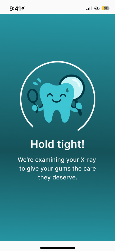
When I first mapped this flow, I underestimated how emotional the X-ray stage would be. That image - your own teeth, color-coded like a traffic light — can feel confronting. I worked to make it less clinical, more compassionate.
My Design Process
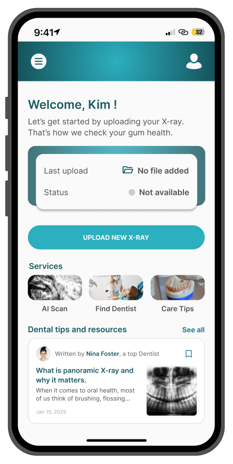
I designed a simple, intuitive journey that respects the emotional weight of dental care:
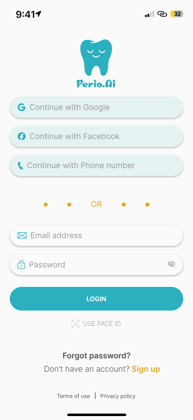
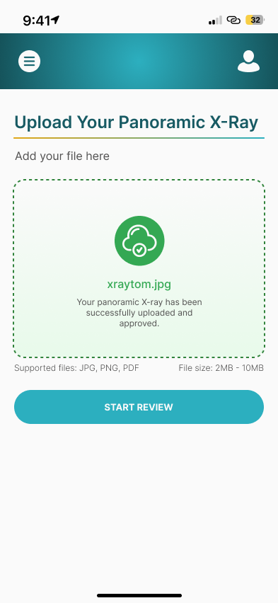
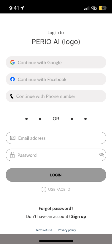
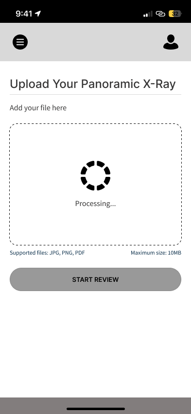
1. Login via email, Facebook, or phone
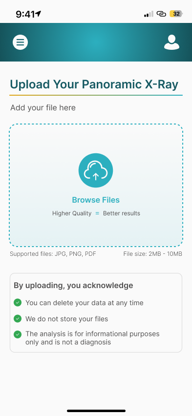
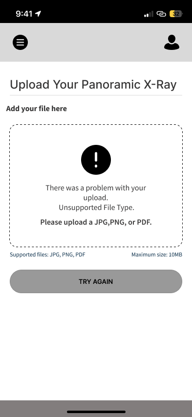
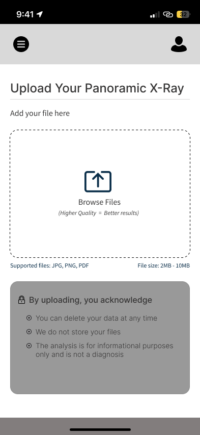
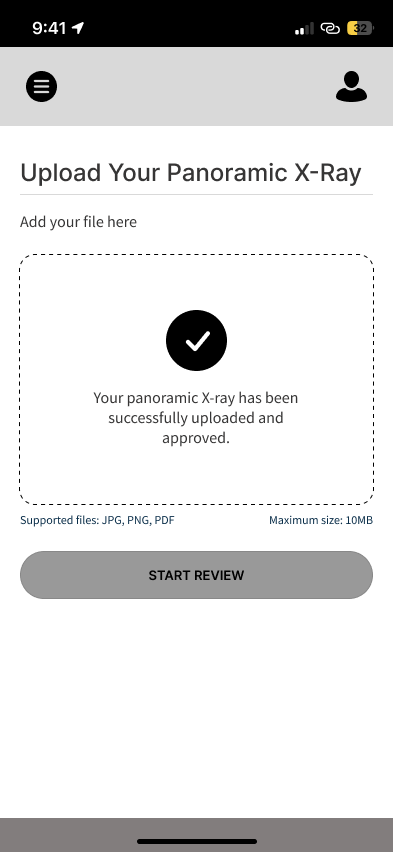
2. Upload your dental X-ray (with AI guidance if needed)
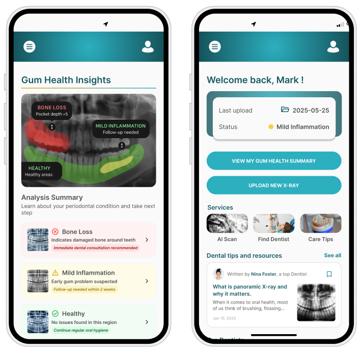
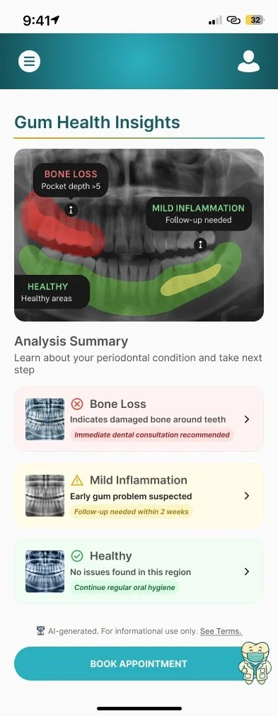
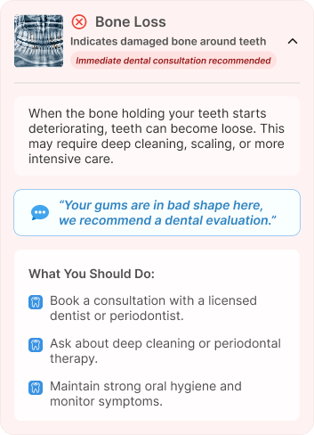
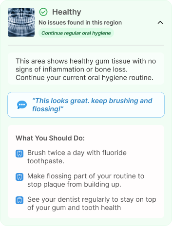
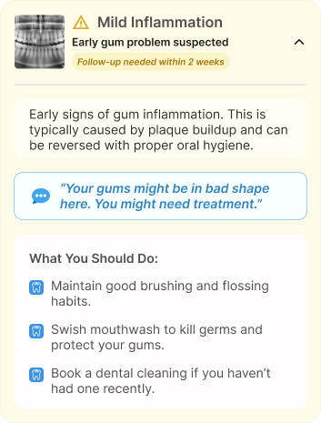
3. View a color-coded summary — red for concern, green for healthy, yellow for areas to watch
4. Read a plain-language explanation of what the AI found
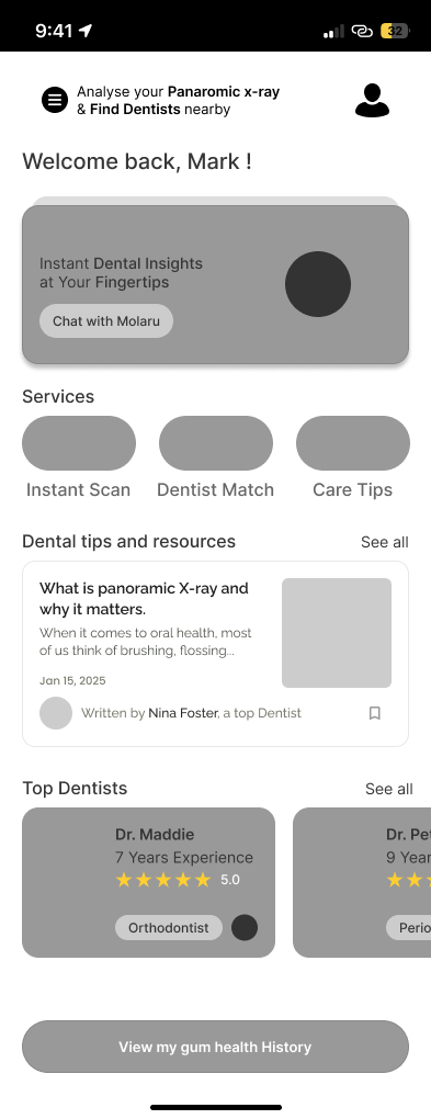
5. Ask follow-up questions via a friendly AI assistant
6. Save or export results, or share with a dentist
Strategy & Flows
I started with low-complexity user flows, optimizing for minimal input and intuitive steps. My focus was on building clarity and control into each interaction.
Low-Fidelity Wireframes
Next, I created wireframes to explore layout hierarchy and information architecture. I prioritized visual accessibility, straightforward navigation, and minimal friction.
High-Fidelity UI
Once structure was locked in, I built high-fidelity designs that emphasized trust, warmth, an clarity - especially on mobile.
Key Strengths
Intraoral imaging tools Telehealth integrations
Mobile-first user experience, Appointment reminders
This table helped me pinpoint where existing tools fall short for general dental patients — especially when it comes to understanding gum health in a visual, human-centered way.
Flowing with Empathy
Each design decision was made to reduce anxiety and help patients feel confident when interacting with AI-driven medical insights. The UI needed to feel safe and trustworthy, not cold or robotic.
Gaps for Patients
Focused on providers, lacks visual feedback for patients
Clinical UI; no patient-facing summary or second opinion support
Geared toward aligner users, no gum health insights
● Soft teal and blue hues to signal care and clarity
● Rounded cards and gentle shadows for warmth and approachability
● Plain, human language instead of clinical terminology
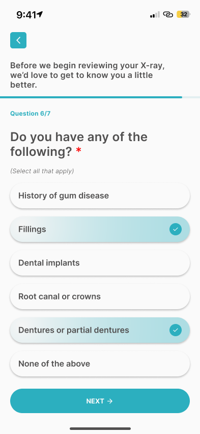
● Progressive disclosure to prevent cognitive overload
● Clear next-step guidance so users always know what to do next
Low-Fidelity Wireframes
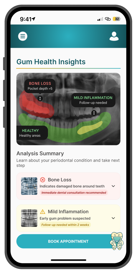
● A layout that puts the X-ray front and center, always paired with plain-language explanations and actionable next steps
● One subtle but powerful detail: instead of overwhelming users with medical terms up front, I added a small downward arrow beneath the visual summary. When tapped, it expands into a more detailed explanation. It’s a gentle invitation to learn more, without pressure — almost like a calm, kind dentist whispering, “Let me walk you through this.”
What I Learned
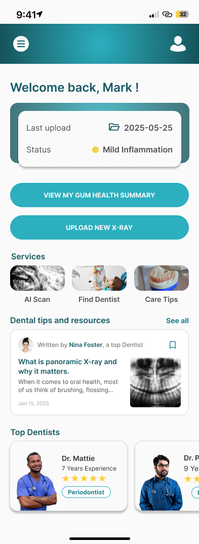
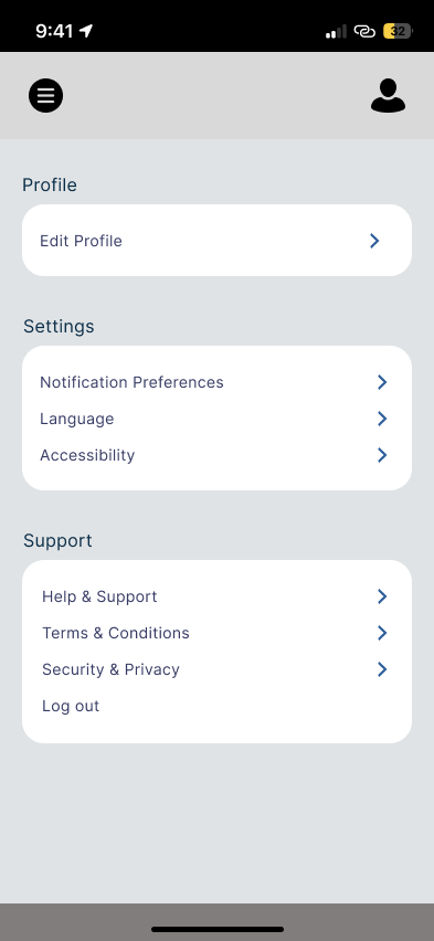
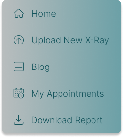
Quick Access Side Panel for Key Patient Actions
● Fast access to patient-critical actions
● Clear, easy-to-scan navigation
● Supports confidence and ease of use
I conducted usability testing with 15 participants to validate clarity, ease of use, and patient confidence.
Participants were asked to complete key tasks:
● Upload a dental X-ray
● Understand the color-coded gum health summary
● Find plain-language explanations
● Download their report
● 100% task completion rate across all core flows
● 96% of participants understood AI feedback within the first minute
● 92% reported feeling more confident about their gum health after reviewing insights
● Users clearly understood their gum health without external guidance
● No critical usability issues were identified
● The experience was described as clear, calm, and reassuring
Giving Patients a Voice
● Another moment I didn’t expect to matter as much: the AI chat assistant
● We called it “Ask Molaru.” It let users ask simple questions about their condition in their own words
● No judgment. No jargon. Just gentle, conversational support
Usability Testing
Key Outcomes
The results confirmed that the design effectively supports patients in understanding and accessing their dental health information with confidence — without requiring major usability iterations at this stage.
✔️ Designing for healthcare is emotional work. It’s not just about systems or screens — it’s about how people feel when they face uncertainty.
✔️ Visual trust matters. People trust what they understand. And they understand what they can see, name, and revisit.
✔️ Simplicity is the most powerful tool. The hardest part wasn’t adding features — it was letting go of everything the user didn’t absolutely need.
Impact
Perio.AI’s gum health summary is more than a feature. It’s a bridge between diagnosis and understanding, between technology and humanity. Whether it’s Emily checking her report on the train, or John sharing it with his daughter over dinner — the goal was always the same: Help people feel more informed, more in control, and more cared for.