
Weather App for Travelers & Planners
CASE STUDY
ROLE
DURATION
Solo UX/UI Designer
48 hours
TOOLS
FIGMA
Year
03/05/2025
Design Challenge
PM Accelerator
As part of a 48-hour design challenge for a UX/UI internship application, I was tasked with creating a weather app for two very different audiences:
● Frequent travelers who need fast, location-specific updates.
● Long-term planners who rely on seasonal weather patterns for big-picture decisions.
At first glance, I thought, “Okay, it’s just a weather app.” But the real challenge quickly revealed itself - it wasn’t just about data or layout. It was about bridging two different mindsets: one driven by immediacy, the other by foresight.
And doing that clearly, intuitively, and beautifully—in 48 hours.
Research & Competitive Analysis
I started by benchmarking top apps like AccuWeather, The Weather Channel, and CARROT Weather.
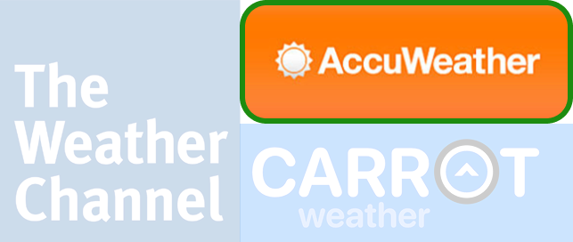
AccuWeather – A reliable app with detailed, data-driven forecasts and strong weather tracking
Supports multiple locations with an easy-to-use interface.
Offers a clear 5-day forecast, including temperature, precipitation, wind speed, and humidity.
Provides severe weather notifications and user customization options for temperature units.
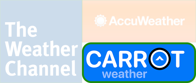
Carrot Weather – A unique, highly customizable weather app that excels in UI and visual representation.
Allows users to add and reorder locations based on preference.
Uses icons, colors, and humor to make forecasts visually engaging.
Offers dark mode and theme customization, making it stand out in terms of appearance settings.
Strengths
● Well-designed forecast cards
● Solid visual hierarchy
Gaps
● Long-term planning was barely supported
● Interfaces felt cluttered and overwhelming
● Very few personalization options
What surprised me: Even big-name apps didn’t support seasonal research or planning. That’s when I realized I had a real opportunity to create something more useful and human.
Impact: This inspired me to aim for a cleaner, more personalized experience—something that didn't just serve the weather, but served you.
The Weather Channel (TWC) – A widely used weather app known for accurate forecasts and multiple location tracking.
Covers real-time weather updates, 5-day forecasts, and severe weather alerts.
Allows users to track multiple locations with clear city names and weather icons.
Provides a concise and visual representation of weather data.
● Emily: A thoughtful family planner organizing vacations, events, and road trip. Sample Scenarios: “Emily is planning spring break and wants to know what March weather in Denver usually looks like.”
Personas & Usage Scenarios
Based on the brief, I crafted two personas:
● James: A corporate consultant flying between cities, who checks weather while rushing through airports. Sample Scenarios: “James just landed in Chicago and wants to know if he needs an umbrella before calling a rideshare.”
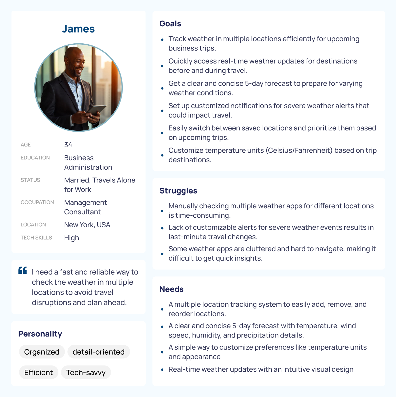
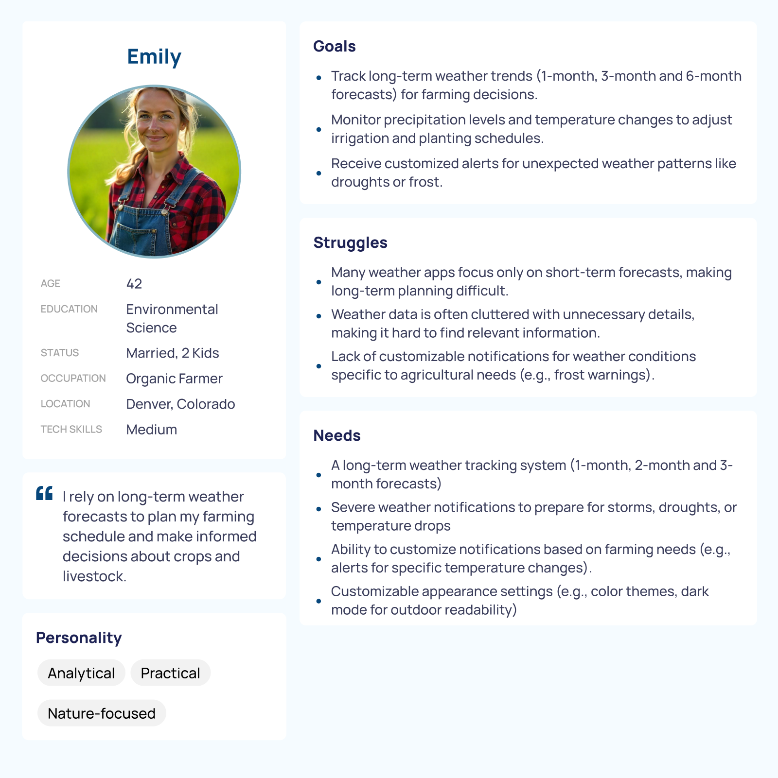
Impact: These personas helped me think beyond the interface—to emotions, moments, and habits. I didn’t want James to tap five times to get what he needed. I wanted Emily to feel calm and reassured that her trip would go smoothly.
Task Flows
With the core flows mapped out, I translated them into low-fidelity wireframes, focusing on layout, clarity, and information hierarchy. This stage helped me clarify priorities. I realized that when users are in a hurry—like checking the weather while walking through an airport—every second counts. Even small delays or unnecessary steps can become frustrating. So I kept the structure minimal and purposeful, emphasizing:
● Quick scalability
● Tabbed navigation for easy access
● Space-efficient, icon-based summaries
Low-Fidelity Wireframes
Each action had to feel fast and frictionless, especially for users with limited time or attention. Impact: These flows gave structure to the app’s bones—simple for James, thoughtful for Emily.
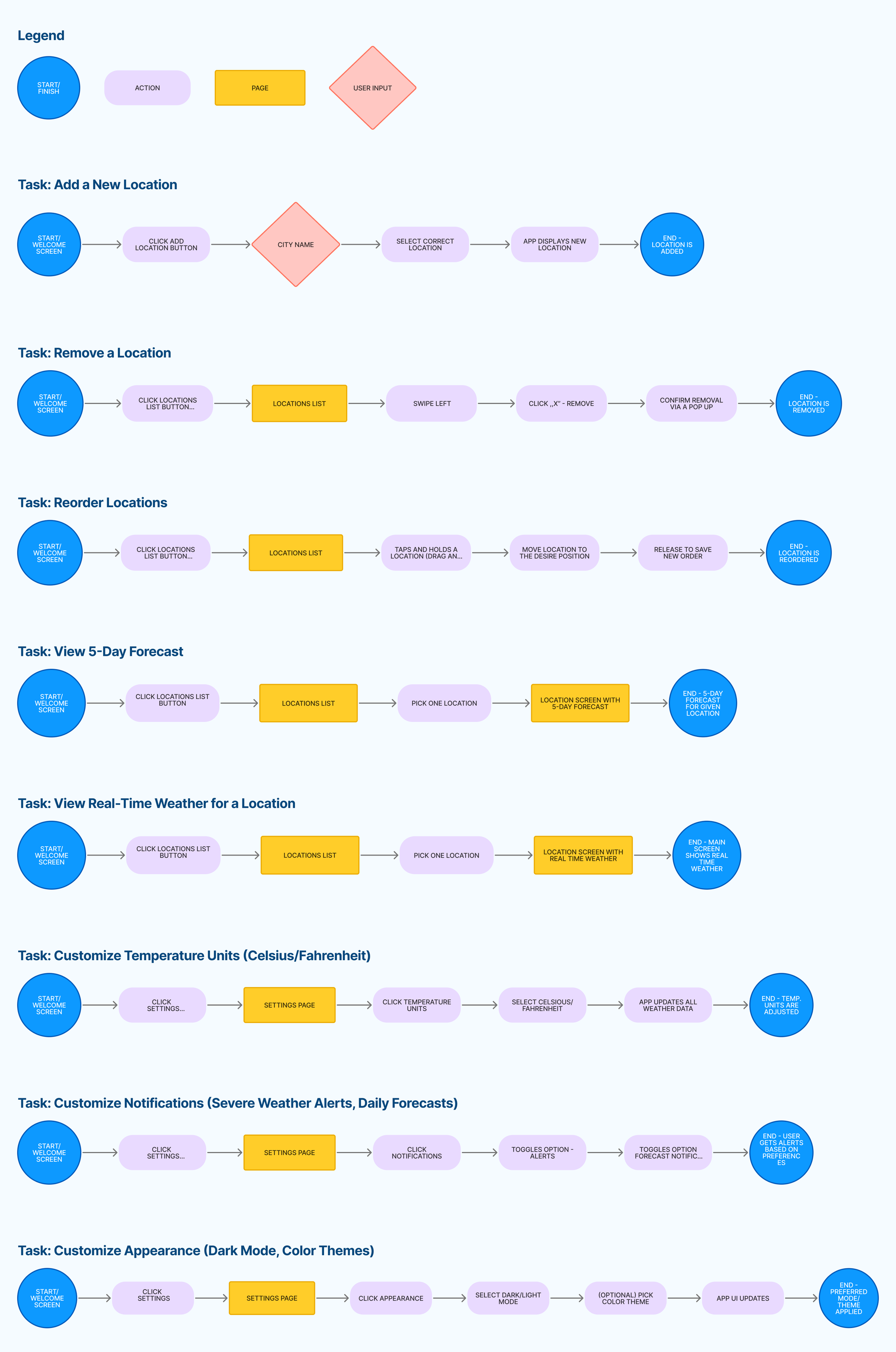
From the scenarios, I defined clear flows:
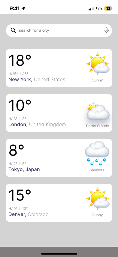
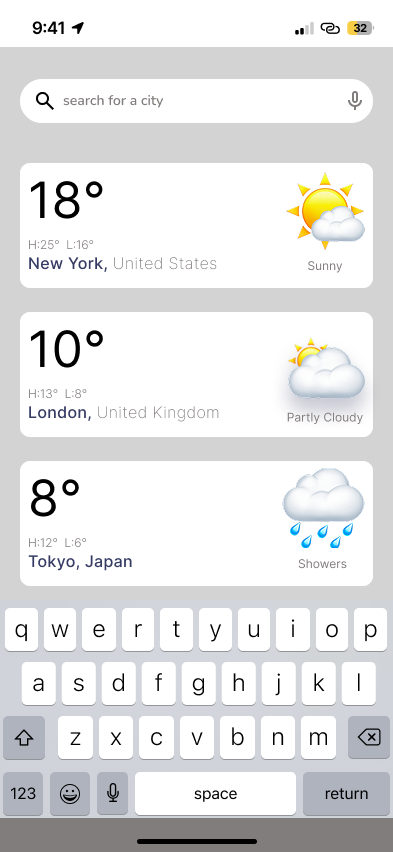
● Add, remove, and reorder cities
● View current and 5-day forecasts
● Toggle between forecast days
● Customize settings: temperature units, alerts, and themes
Low-Fidelity Wireframes
Impact: These wireframes laid the groundwork for an experience that respects the user’s time—whether they’re planning ahead or checking in the moment.
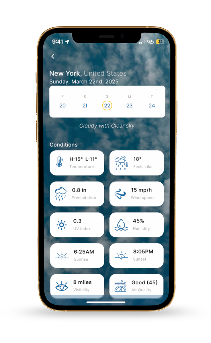
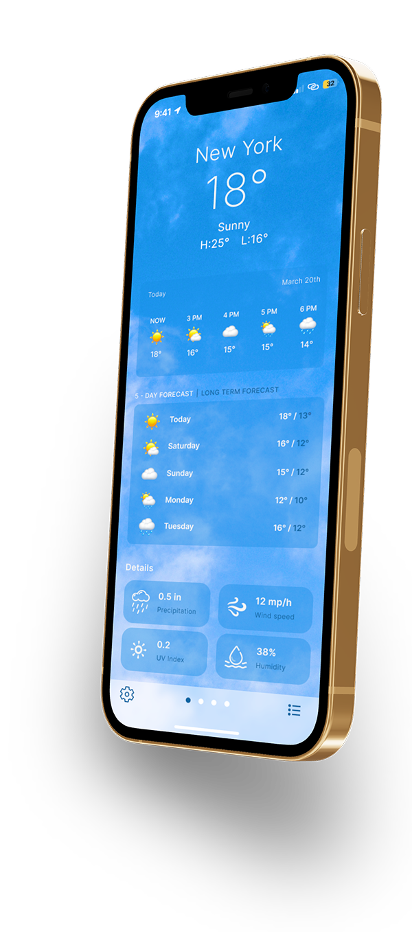
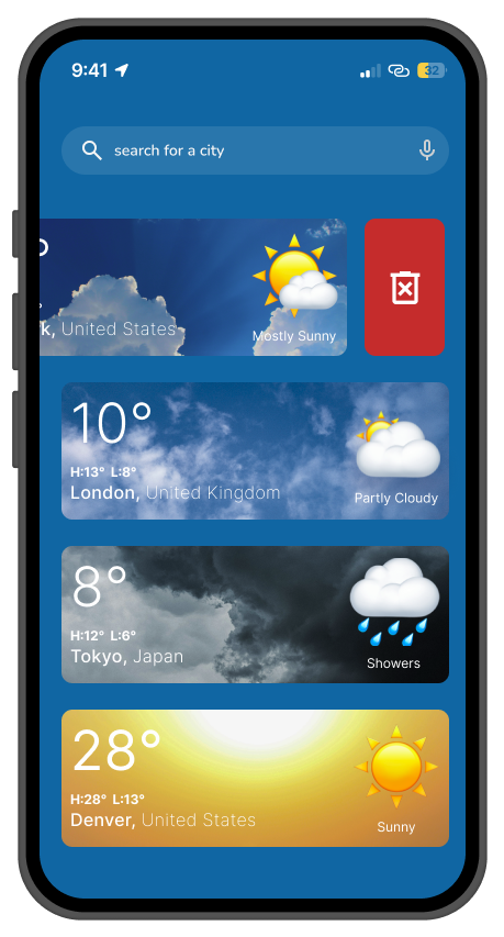
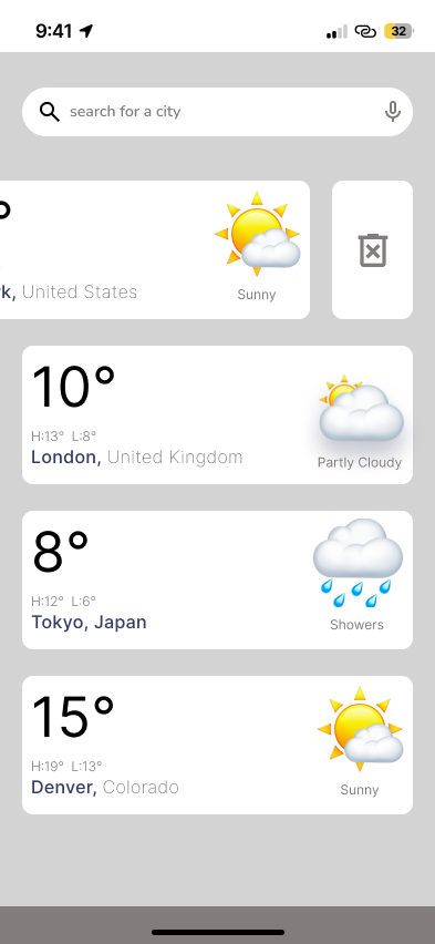
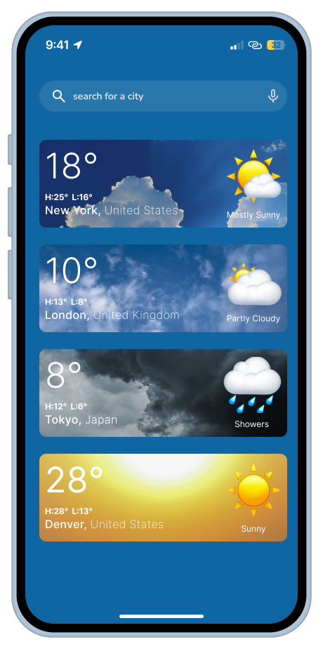
High-Fidelity UI
Add location:
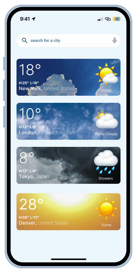
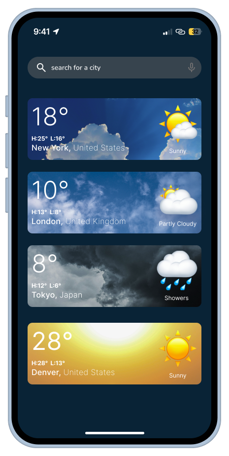
Clicking the search bar lets users type and search for a city
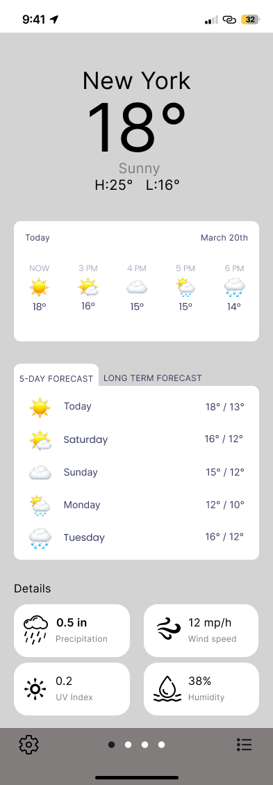
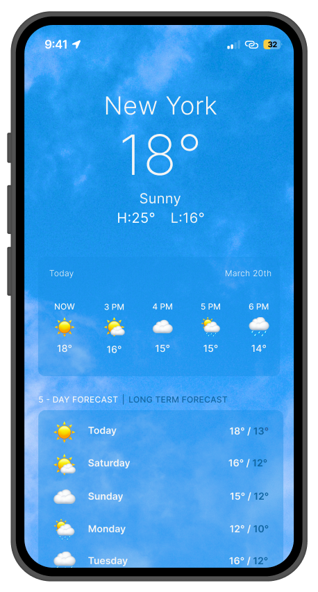
Instant conditions with at-a-glance temperature.
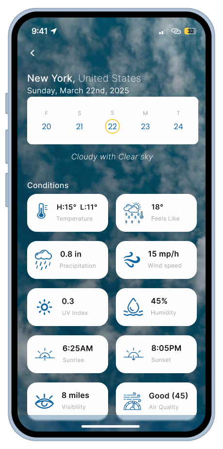
Tap a specific day to view its full weather forecast (details)
NAV BAR - fixed, Settings, easily switch between cities in the forecast, Saved locations
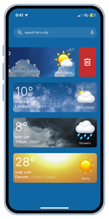
To remove a location, swipe left — a delete icon will appear.
To change the order of locations, drag and drop the desired item.
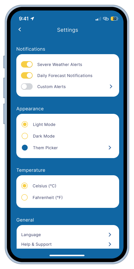
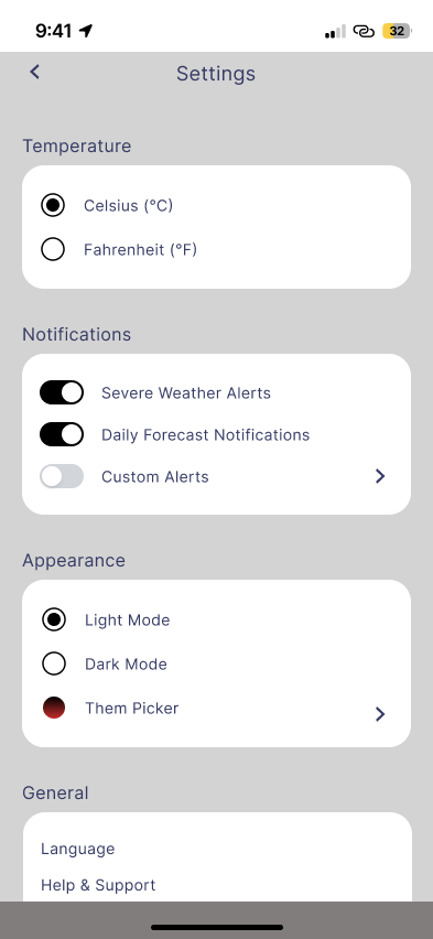
Custom notifications: severe + daily
Customize look: themes, dark mode.
Custom units: Celsius or Fahrenheit.
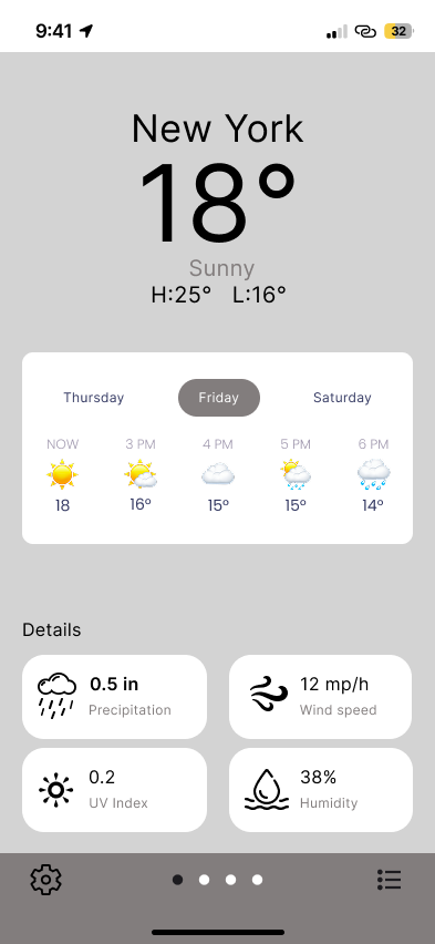
Dark Mode
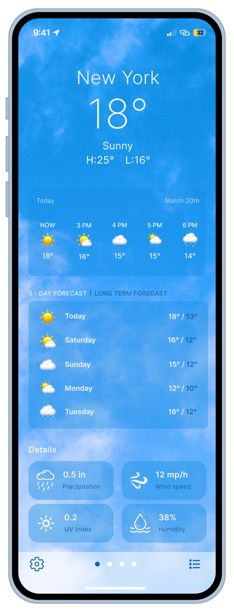
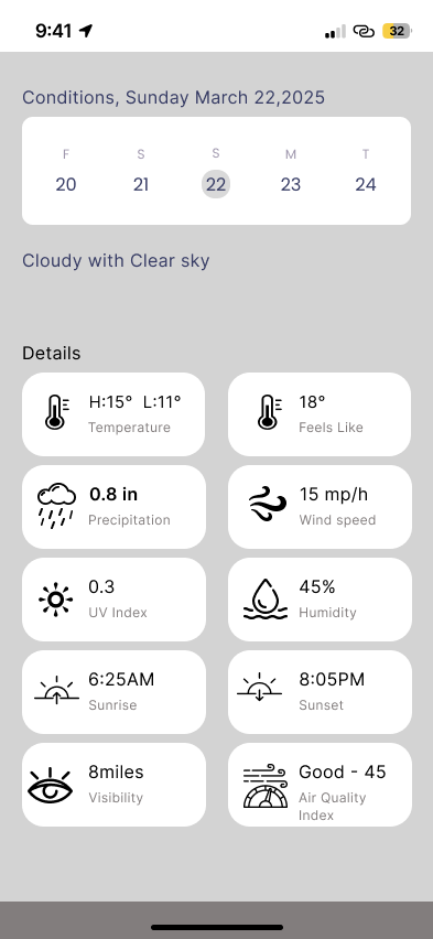
Additional details such as wind speed, humidity, precipitation, UV index
Easily select a different day to view its weather forecast
Low-Fidelity Wireframes
Once I locked the structure, I brought the design to life with:
● A clean, modern aesthetic
● Light and dark mode
● Friendly iconography and clear spacing
● Subtle shadows to guide the eye
I didn’t expect this, but choosing icons was emotional—I realized how much mood a simple sun or snowflake can convey. I tested a few and chose ones that felt inviting rather than clinical.
Click 'Back' to return to the previous screen.
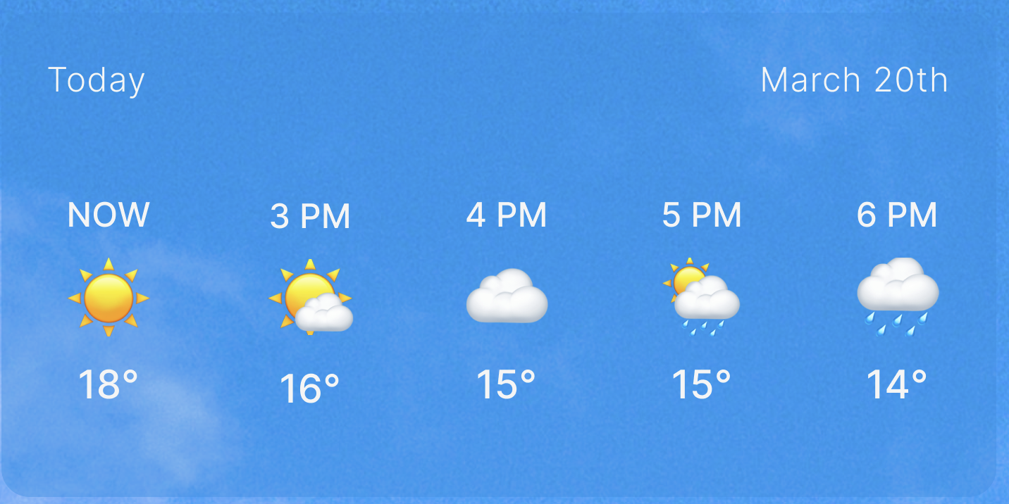
SWITCH (5 day forecast / long term forecast)
Real-time display of current weather conditions for each location
Current Conditions for Selected Day. Details such as wind speed, humidity, precipitation ect.
Light Mode
What Worked
✨
What I Learned
✨
What Changed
✨
What Worked ✨ What I Learned ✨ What Changed ✨
● Designing for extremes creates depth: Building for both James and Emily made me more empathetic—and forced me to design a truly adaptive interface
● Hierarchy is everything: Weather data means nothing if it’s not instantly legible
● Delight is in the details: A drag interaction, a toggle switch, or a theme picker can completely shift how personal an app feels
● Constraints build clarity: With just 48 hours, I was forced to cut the fluff and focus on real UX value
What I Learned
This is a mobile-first, intuitive weather app designed to serve both last-minute scramblers and thoughtful planners. Whether you’re checking for rain before a business meeting or wondering if next April is good for a family hike in Denver, this app helps you feel prepared, in control, and just a little more at ease.
Outcome
● Multi-location support with drag-and-drop reorder
● 5-day clear forecast view with visual hierarchy
● Custom settings for alerts, themes, and units
● Seasonal planning support with extended outlooks